TL;DR: 7 years ago, in 2019, I hand-wrote a scraper for India's trade data. That alone took weeks and I never actually got around to analyzing it. Recently, I rebuilt the whole thing in an afternoon and finally asked the questions I couldn't back then. This post is both: what India's trade data actually says, and what it means that an economics grad with a coding agent can now do in a few hours what used to require a team and a Tableau license.
Why this exists
In 2019, I was an undergrad studying economics, learning Python on the side. As part of an International Economics course, I stumbled upon India's trade data portal. True to my home country's fashion, the data was there but it was highly inaccessible with no download or export options.
Applying my "jugaad" skills, I reverse-engineered the HTML form and wrote a Selenium-based scraper after a lot of trial and error. I uploaded the dataset to Kaggle and it got quite popular. As of this writing, it has 150K views and 27.4K downloads.
However, I never actually got around to analyzing the data. I had created a basic dashboard with Shiny and R, but it was not thought out and soon, I forgot all about it. At that point, my goal was to learn how to code, not how to do analysis. I barely looked at what the data said.
Fast forward to today, seven years later, I was walking back home one day and suddenly recalled this project. I was quite confident that I could rebuild the whole thing in a couple of hours, with my knowledge and experience accumulated over the last seven years, as well as the advancements in software development. Writing code is now trivial, nobody will challenge that. However, the hard part still remains: knowing which questions to ask.
Here's what I found.
What the data says
The macro picture
India's merchandise trade story starts with a simple but important fact: imports are consistently above exports. India's merchandise sector is operating with a persistent external imbalance: growth in domestic demand and production repeatedly pulls in more imports than the export base can finance. That is why the deficit survives across very different macro environments - pre-COVID, lockdown, reopening, and commodity shock. The gap narrows only when the economy compresses, not when it becomes more competitive.
The post-FY21 widening is especially important. A superficial reading would say trade recovered after COVID. A better reading is that India's recovery was import-hungry: when GDP grows, India pulls in more fuel, intermediate goods, machinery, and other tradables than its export base can keep up with. Exports also rose after the pandemic, but not nearly fast enough to offset the surge in imports.
That asymmetry also points to a hypothesis about India's place in the global economy: it is not a low-cost export platform generating broad-based trade surpluses. It is a large domestic economy whose expansion still relies heavily on foreign inputs and commodity imports. Even some of its export success is import-linked: refined petroleum exports depend on crude imports, and electronics exports depend on imported components and machinery. So the chart is really showing a familiar development pattern: industrial upgrading without full supply-chain autonomy.
So where does the deficit actually come from?
Where the deficit lives
The diverging bar chart here shows India's bilateral trade balance over the years for the top 8 countries on each side, and they reflect two very different roles in India's trade structure.
On the right side, we have countries that India runs a positive trade balance with. For FY25, this included countries such as the United States (+$40.9B), Netherlands (+$17.8B), and Bangladesh (+$9.5B). These are countries to which India tends to sell higher value-added or final goods - refined petroleum products, pharmaceuticals, engineering goods, electronics, and a range of manufactured exports. These are markets where India is more competitive as a processor, assembler, or exporter of finished output than as an importer.
On the left side, we have countries that India runs a negative trade balance with. For FY25, this included countries such as China (-$99.2B), Russia (-$58.9B), and the UAE (-$26.8B). These are countries from which India buys strategic inputs: energy from Russia and the Middle East, and manufactured intermediates and machinery from China and South Korea. These relationships reveal where India remains structurally dependent on the rest of the world.
Put another way, India's surpluses come largely from selling outward into consumer and industrial markets, while its deficits come from importing the fuel, intermediate goods, and raw materials that keep its own economy running. The country earns foreign exchange by exporting value-added products, but spends it on the imported inputs that support domestic consumption, energy security, and industrial production. The deficit is therefore not diffuse — it is concentrated in a small number of strategically important relationships.
The Russia pivot
To understand the energy trade story, it helps to zoom in on HS Code 27: mineral fuels, mineral oils and products of their distillation; bituminous substances; mineral waxes. This is the chapter that captures the core of India's energy imports - crude oil, petroleum products, natural gas, coal, and related fuels.
Before February 2022, India's mineral fuel imports followed a fairly stable pattern. The main suppliers were the Gulf producers — especially Iraq, Saudi Arabia, and the UAE. In FY21, for example, Iraq supplied $14.2B, Saudi Arabia $13.0B, and the UAE $11.8B of HS27 imports. Russia, by contrast, supplied just $2.1B, or about 2% of the total. It was present, but barely noticeable, almost as if it was a rounding error.
That changed abruptly after the war in Ukraine. As Russian crude was discounted and Western demand pulled back due to sanctions, India sharply increased purchases. The numbers are telling: Russia's share of India's HS27 imports rises from 1.3% in FY19 to 2.1% in FY21 to a whopping 26.0% in FY25. In dollar terms, that is a jump from $2.1B in FY21 to $56.9B in FY25.
What makes this such a useful chart is that it shows the shift as a reallocation within the supplier mix, not just a rise in total fuel imports. Iraq, Saudi Arabia, and the UAE do not disappear, but they stop being the unquestioned center of India's energy basket. Russia effectively inserts itself on top of the old Gulf-heavy structure and quickly becomes the largest single source. By FY25, India's HS27 import profile looks fundamentally different from the pre-war pattern.
Economically, this was less about geopolitics than arbitrage and energy security. India is a large net energy importer, so when sanctioned oil becomes available at a discount, the incentive to buy it is enormous. The shift improved access to cheaper crude, supported refinery margins, and helped cushion the domestic economy from the full force of the global energy shock. In that sense, the “Russia pivot” was not a diplomatic statement. It was simply a market response by a price-sensitive importer.
The China paradox
Now, let's address the "dragon" of the world: China.
Despite the ruling party's push for "Atmanirbhar Bharat" (self-reliance), banning of Chinese apps like TikTok and WeChat on "security grounds", and "China+1" becoming a corporate boardroom mantra - India's import dependence on China has grown (quite significantly), not shrunk.
The bilateral deficit hit a record ~$99B in FY25. The core categories in the heatmap tell the story. India is not mainly importing consumer fluff from China; it is importing the building blocks of its own economy. The largest categories are electrical machinery (HS85), which rises from $20.6B in FY19 to $38.0B in FY25, and machinery and boilers (HS84), which rise from $13.4B to $25.9B. These are the components, equipment, and capital goods that sit upstream of manufacturing and investment. Then there is organic chemicals (HS29) — about $11.5B in FY25 — which are crucial for pharmaceutical production. Plastics, metals, and medical instruments add to the same pattern.
That is the real paradox. India's electronics manufacturing story has improved, and domestic assembly has expanded, but the chart suggests that a significant part of that expansion still depends on Chinese inputs. The same goes for industrial machinery and parts of pharma. India may be moving up the value chain in some sectors, but it is doing so while remaining deeply tied to Chinese supply chains underneath.
This is what makes the next section - India's production-linked incentive (PLI) scheme - more impressive, not less. India is trying to break free. And in one specific category, it's actually working.
The PLI miracle
The stacked area chart shows India's export composition over time, and one band is growing faster than everything else: electronics (HS85, in saffron at the bottom). It rose from about 4% of India's exports in FY19 to 10% in FY25, which is a large shift in a basket this big. Within that, the sharpest jump comes from phones and related telecom equipment under HS8517, which go from about $2.6B in FY19 to $25.9B in FY25. That is a genuine change in what India is selling to the world. By some reports, 1 in every 4 iPhones sold in the world is made in India.
The Production Linked Incentive (PLI) scheme for large-scale electronics, launched in 2020, pays companies to manufacture electronics domestically. What makes the chart more persuasive is that this rise happens alongside a visible decline in some of India's older export pillars. Gems and precious metals fell from about 12% of exports to 7%, while electronics steadily expanded from a marginal band at the bottom into one of the more important layers of the export basket. The PLI story shifted the composition of exports toward a more manufacturing-intensive category.
After the previous chart showed that India still depends heavily on Chinese electronics inputs, this one shows that India has nevertheless started building capacity at the output end of the chain. The country may still import a large share of its components, but it is increasingly assembling, processing, and exporting higher-value finished goods. PLI has not eliminated dependence — but it does appear to have nudged India one step up the value chain.
Is India diversifying?
The logical next question to ask is: is India diversifying its exports? In economics, the Herfindahl-Hirschman Index (HHI) measures how diversified or concentrated a country's export market is across different destination countries. I vibe-coded this explainer below to help you understand it.
The chart below shows the effective number of products and partners — a measure derived from the Herfindahl-Hirschman Index (HHI). The intuition here is that if India exported equally to N countries, the effective number would be N. A higher effective number means more diversification. Think of it as answering "how many equal-sized baskets are India's export eggs spread across?"
The key takeaway here is simple: India's exports have not become clearly more diversified over this period. The orange line tracks product diversity — how evenly exports are spread across HS2 chapters — and the green line tracks partner diversity — how evenly exports are spread across destination countries. In FY25, both sit at about 17, meaning India's exports are as concentrated as if they were split equally across 17 product categories and 17 countries:
-
Product diversification. India's effective number of export products has hovered around 17-18 HS2 chapters throughout the period — meaning India's export concentration is as if it exported equally across about 17 broad product categories. This barely changed despite the PLI-driven electronics surge, because electronics simply replaced gems at the top of the basket rather than broadening it.
-
Partner diversification. This is where the data gets uncomfortable. The effective number of export partners fell from 21 in FY19 to 17 in FY25. India's exports got more concentrated, not less — and almost all of that is the US. America's share of India's exports grew from 16% to 20%, and because HHI squares the shares, that single shift dominates the entire index.
So if the earlier PLI chart was the optimistic one, this is the reality check. India has had some success shifting the composition of exports toward electronics and manufacturing, but that does not automatically translate into broad diversification. The country may be upgrading in some sectors, yet still remain concentrated in both the products that matter most and the markets that buy them.
How this was built
In 2019, the scraper was the project. I spent weeks reverse-engineering form fields, wrestling with Selenium, and debugging flaky selectors. By the time it worked, I was too exhausted to do any actual analysis. The engineering consumed all the time, and the economics questions I originally wanted to answer never got asked.
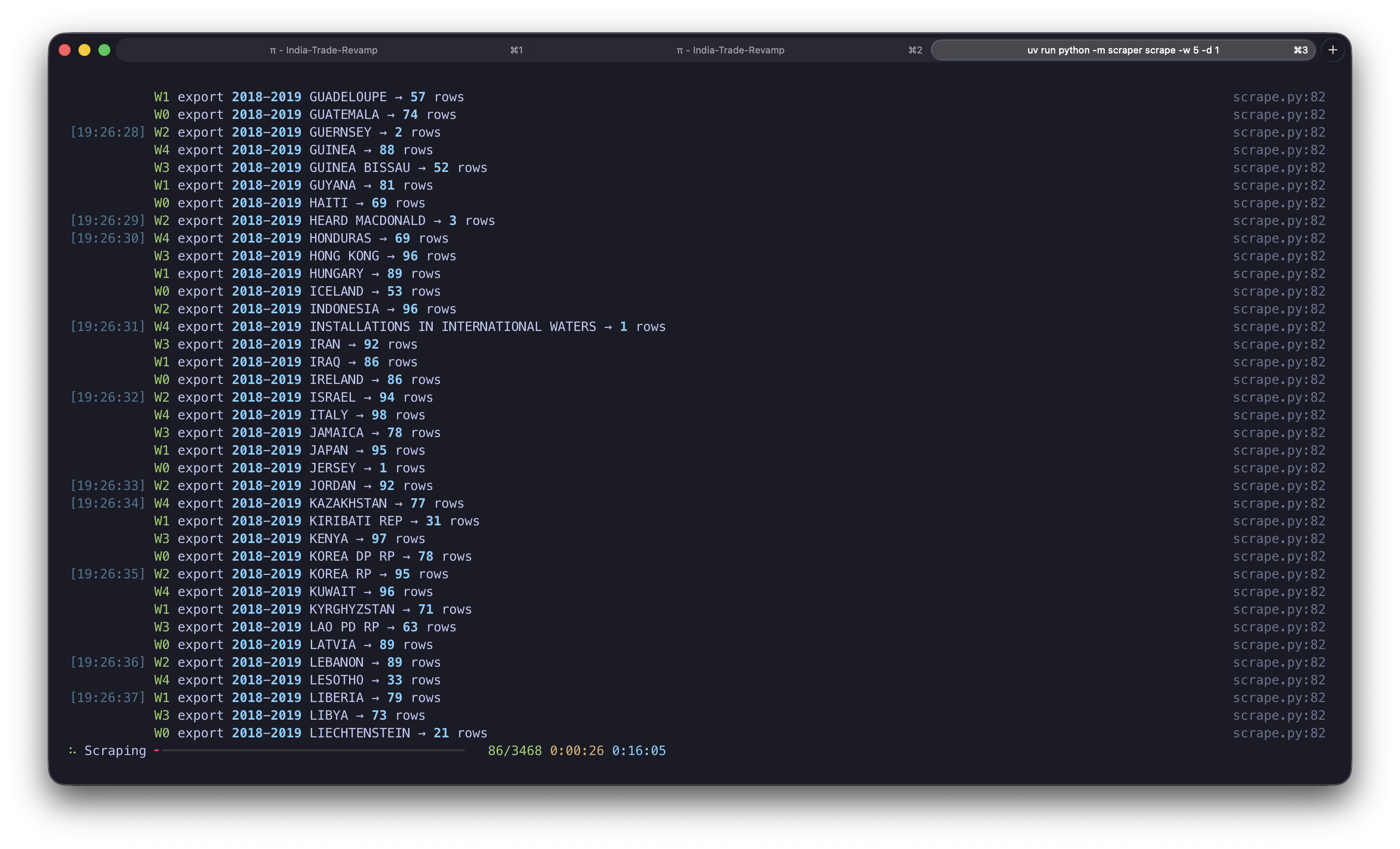
Seven years later, the engineering was a footnote. Building and validating the new scraper took me a single agent session (shoutout pi!) — you can see the entire trace here. I gave the agent my previous project's code, asked it to revamp it with proper controls and parallelism, and in about 20 minutes I had all the data scraped and saved as Parquet files, ready for analysis.
That meant the real work could finally begin: sitting with the data and asking questions. Which countries drive the deficit? What happened to energy imports after 2022? Is PLI actually showing up in the export numbers? These are the questions my economics brain wanted to ask seven years ago. The difference now is that the tooling got out of the way and let me focus on them.
Most of the analytical workflow was conversational — I'd ask a question, the agent would write the code to answer it, and we'd iterate on the visualization. I created a theme file early on so the charts looked consistent across the post.
The part that genuinely surprised me was the interactive charts. Custom Plotly visualizations with tab controls, dropdown selectors, heatmaps, choropleth maps — all embedded directly in this blog as React components. I've built similar dashboards before inside Tableau and Power BI, and they always required dedicated tooling and a separate hosting story. Here, the agent wrote the chart code, the embedding components, and the data pipeline, and it all lives on my personal website. I've written before about the age of personal software, and this is perhaps the clearest example yet: the entire analytical workflow — from scraping to interactive publication — done by one person over a few afternoons.
India's trade atlas
With that context, here's the thing I'm most proud of building for this post. The map below is a dashboard that lets you explore India's trade relationship with any country in the world, for any year. I've shared my reading of the data above — now go find your own stories.
Trade Atlas
Closing thoughts
India's trade story, as the data tells it, is one of a large economy that is upgrading selectively but not yet broadly. The deficit is structural and concentrated — driven by energy and Chinese intermediates. The Russia pivot reshaped the energy map in three years. PLI has delivered a real shift in electronics exports, but that success hasn't translated into wider diversification; the export basket and partner mix are actually more concentrated than they were in FY19. India is moving up the value chain in places, but still without full supply-chain autonomy.
And for me personally, this project closed a loop that had been open since undergrad. The questions I wanted to ask in 2019 — about deficits, dependencies, and what India actually trades — were always the interesting part. I just didn't have the tools or the motivation to get to them quickly enough. Now I do, and the gap between "I wonder..." and "here's what the data says" has never been smaller.
The full dataset, scraper code, and chart generation scripts are available on GitHub. Thank you for reading and I hope you found this blog post interesting. If you have any feedback or want to discuss anything else, please feel free to reach out to me on X/Twitter or LinkedIn.